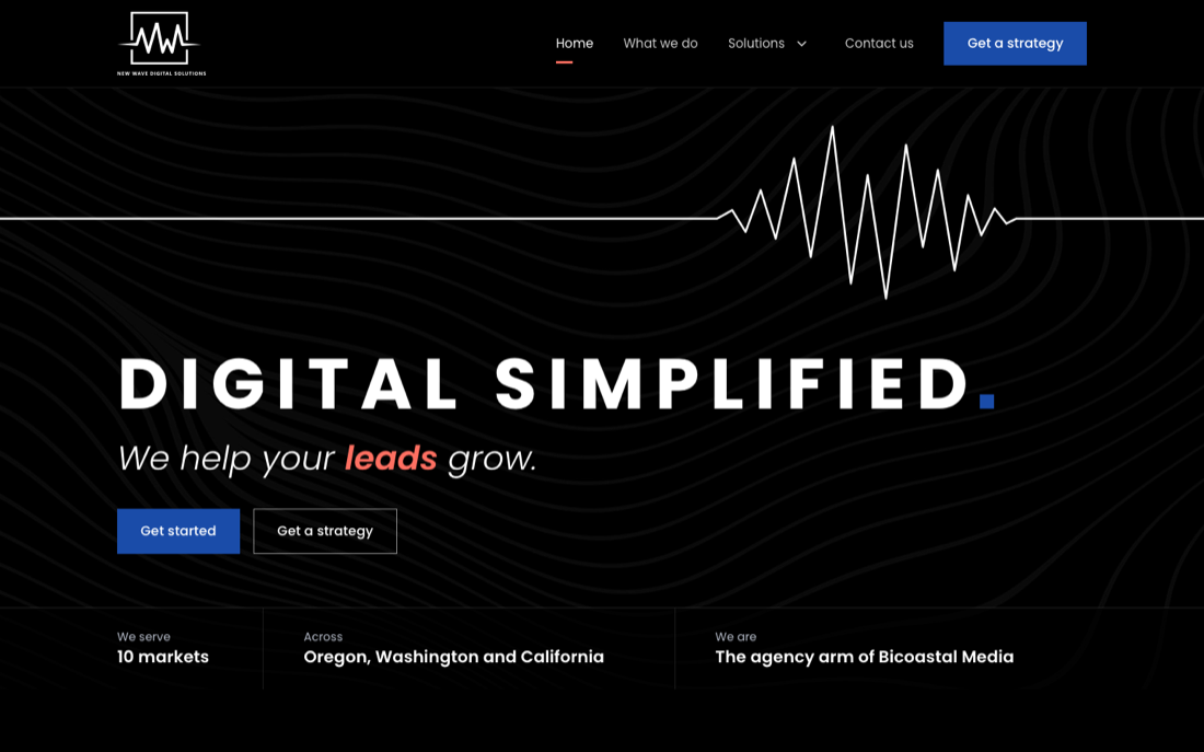
1 Signal
DarkThe current brand, grown up. Black, white and Poppins as today, with a proper structure and the logo's waveform as the signature.
- Borrows from
- Townsquare Interactive, 2060 Digital
- Type
- Poppins
Each option is the full eight-page site with the same content and brand colors. They differ in layout, type and structure, and each borrows specific pieces from competitor sites. Open one, then use the small pill at the bottom left of any page to step to the same page in the next option.
The current brand, grown up. Black, white and Poppins as today, with a proper structure and the logo's waveform as the signature.
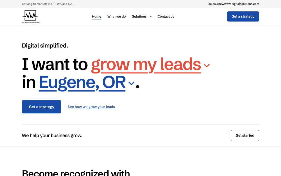
Conversion first. The hero is a sentence you complete, "I want to ... in ...", and it carries your answers straight into the form.
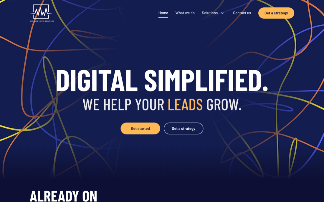
The radio heritage, out loud. Condensed broadcast type, the brand's scribble artwork, and a tuner dial for the ten markets.
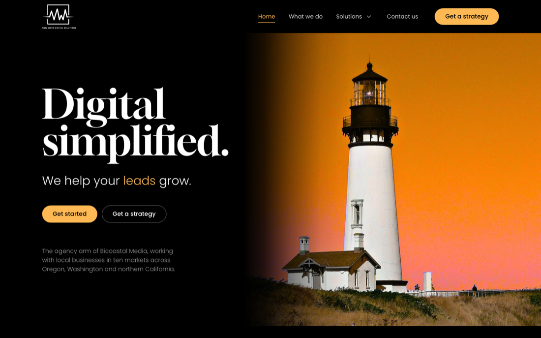
Editorial and calm, built on their own lighthouse photo. Serif headlines, amber accents, New Wave as the steady local guide.
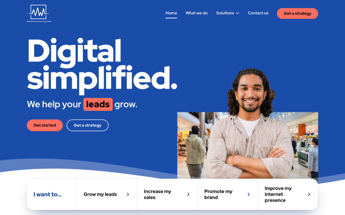
The brand blue takes over from black. Heavy headlines, wave-shaped section edges, and a big question beside the form.
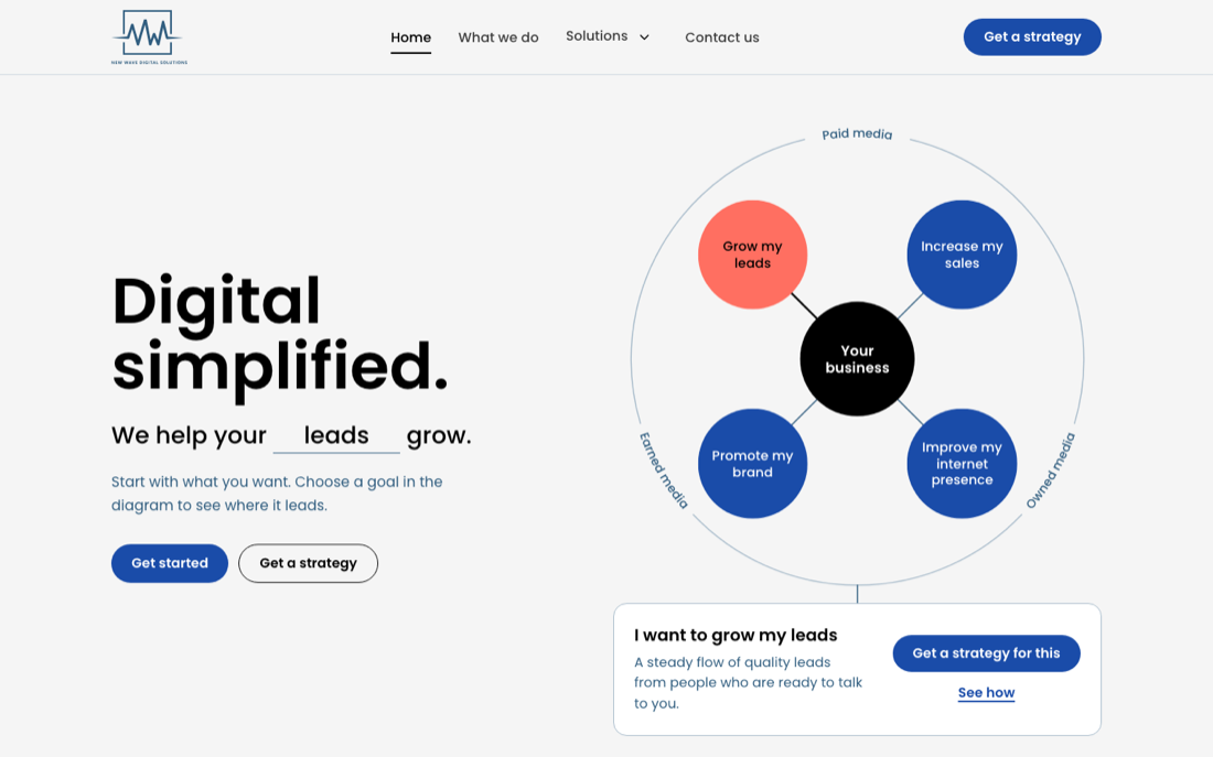
Shows how it fits together. A live diagram links your business to the four goals, their services and the three kinds of media.
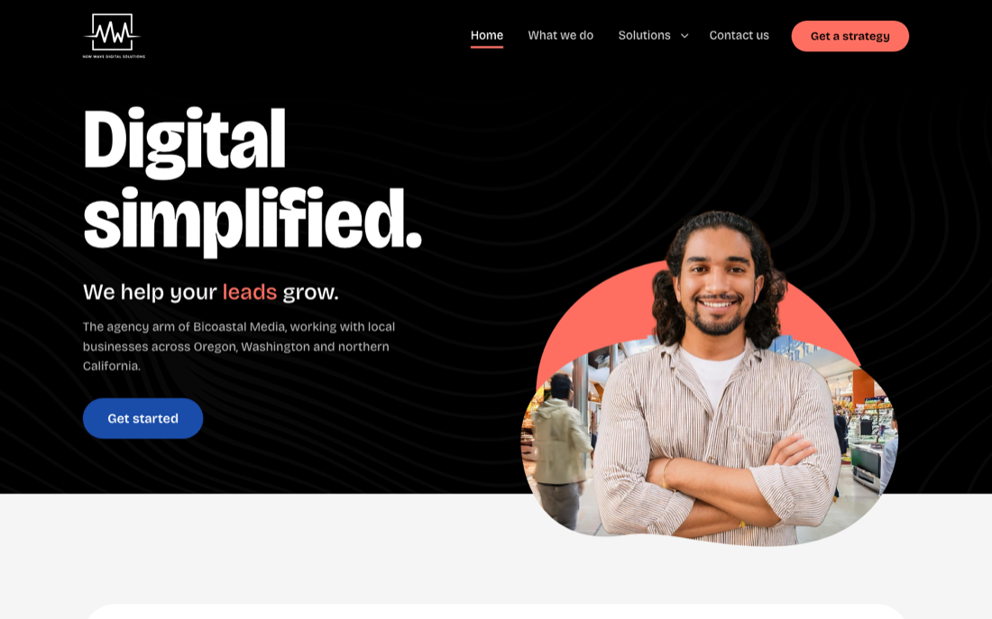
The polished agency. Dark hero, light body of large rounded panels, and the goals set as outlined-and-solid word lockups.
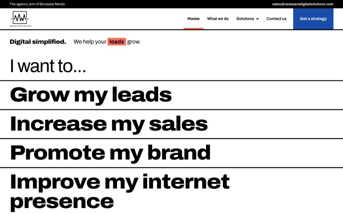
Type does everything. No hero photo: "I want to..." and its four endings are a giant menu in black, white and solid blue.
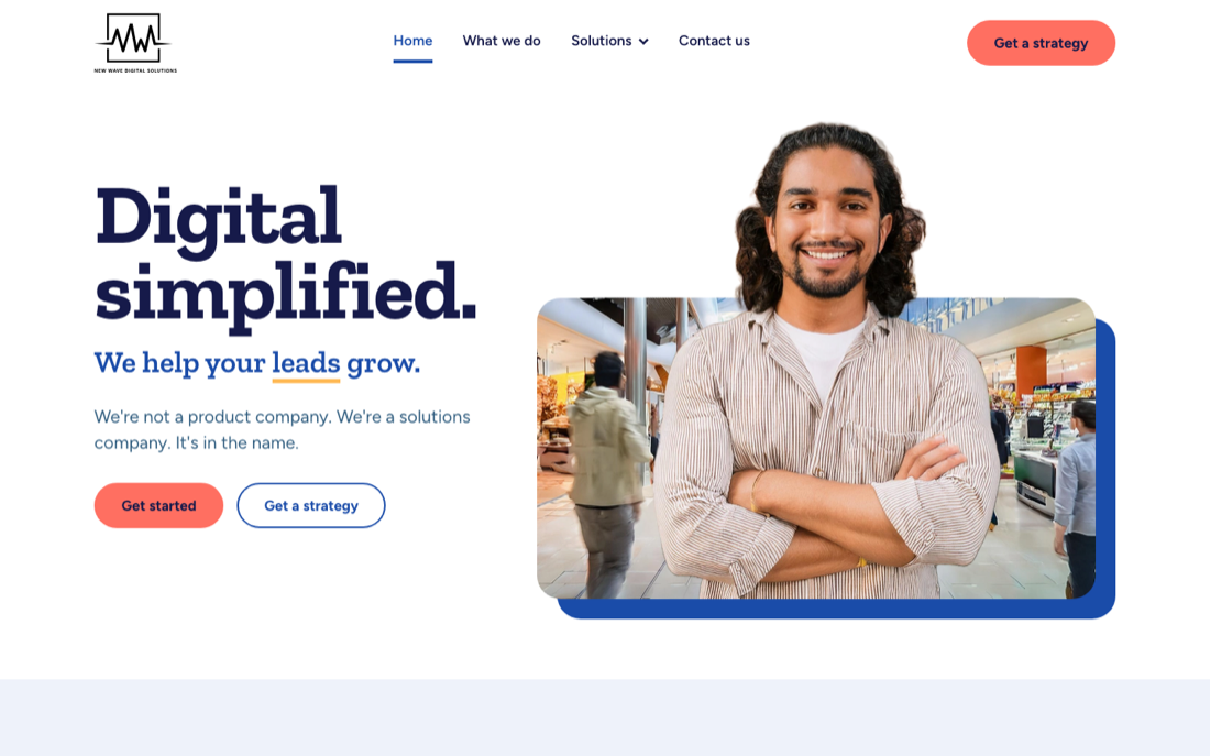
Local people, plain talk. Big friendly faces breaking out of solid color blocks, a slab headline face, and an obvious next step.